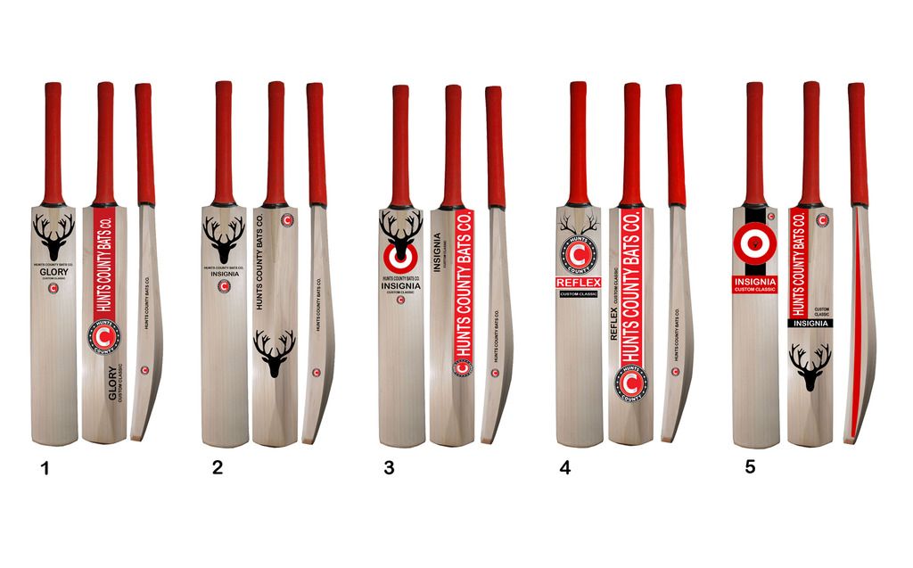
Hunts County are a company close to my heart. I've used them ever since a kid, and scored my first ton using the Steelback in large handle. Yet it hurts me to say that their branding is all over the shop and to be honest is the reason that I moved onto a different bat brand; and no doubt the reason many other cricketers opt for other brands. I know of people that have got HCB to make their bat yet asked for no stickers. For me, as a branding person this is not a great sign! It sounds very vain when thinking about it but too be honest when you spend a fair amount of money on a piece of wood then you want it to look nice right? I drop in and out of the forum, as without sounding massively hypocritical it does get very geeky about grains, "philosophies of a seller" and the amount of bats people have. But branding is interesting (well, at least for me) and thought I'd create some sort of discussion!
Back to HCB; at some point they decided to move on from the stag design, and gradually phased into the iconic C logo. I'm not sure how offended people were of the stag, as I actually quite liked it. Original, stood out and you knew it was a Hunts County Bat. Which goes onto next point. They use HUNTS, and County, and Hunts County within their branding to no real avail. Yes we know GM to be Gunn & Moore and GN and Gray-Nicolls yet they have slightly more awareness than HCB. So with the phasing out of the stag into the C, along with brand identity issues, then HCB wanted to get stickers to suit. I'm sure some people like the current (2012ish - current) stickers yet to me they look cheap. The thing with HCB is you really get value for money. They have cracking (bad pun?!) craftsman that make a quality products and charge 35% less for their top end bats which if we're completely honest, do the exact same job... help us score runs (or not in my case most of the time).
If they had their branding down, with nice stickers and a little bit of coverage (appreciate budget for international cricketers is not quite there, but for decent county BATSMEN) then they really would do well and perhaps be taken on my more retailers etc and be a more in demand company.
No doubt, the brief HCB gave to the designer was to incorporate the new logo and to appeal to the younger market. I think their main audience is schools and womens cricket? But with the latest trend for slightly retro bat designs, with less is more being key (again like my batting) so I have thought this the best route to go down. So, as I read this post about HCB and always thought the stickers need re-jigging, then I spent 30 minutes at lunch having a play (I'm not a designer before I get a stream of haters!) to see if I could do better. So I created a few designs. What do you think? I've tried to blend brand colours red/black, with their new logo and incorporate the stag heritage. Some elements are better on one design to another...
Perhaps HCB HQ may see this thread and consider a change. I stress however, their products are sensational. If they re-stickered, then maybe might sell more of them and get more air time on threads such as this.

 Author
Topic: Hunts County (Read 11028 times)


 Author
Topic: Hunts County (Read 11028 times)
